Organizing a Design Sprint
A short synopsis of a proper cross-functional
team design sprint to solve a complex problem
Project Overview
Situation
Redesign a problematic feature and build consensus between design, engineering and product management through a cross-team design sprint
Task
Find a way to handle image and video content in an interface that was originally designed only for text
Action
Conduct a five-day design sprint including team members from design, app and product management to quickly identify radical solutions that can be prototyped within the week
Result
The team co-created a solution, tested a prototype with customers, demonstrated the value of the design process to new stakeholders, and moved the prototype onto the roadmap for implementation
Tools
Sticky Notes
White Boards and Markers
Pencil and Paper
Sketch
Xcode
Zoom
Snacks
Time
1 Week
My Role
Design Lead
Design Sprint Organizer and Facilitator
Mapping the Problem
Creating a map involves asking questions about the problem and serves as a guide for how the team might solve this particular quandary. These are the kinds of questions you should ask for any project.
Why are we doing this project?
Where do we want to be in 6, 12 months?
What problems do we hope to solve?
Our Goal
Review the day's content quickly for the majority of users without needing to dig much deeper
How Might We…?
How Might We (HMW) notes are a great way to ask questions about our problem that might lead to some interesting solutions. Our ideas broke down into eight different categories.
The team reviewed the sorted HMW notes as we prepare for our next task: assembling this jumble into a coherent user journey.
Customer Feedback
At the same time we were gathering internal telemetry data that would guide our decision making, we scoured product reviews to provide some insight into customer perception.
“…notifications are uncontrollable…”
“…thumbnails do not contain useful images…”
“…want to quickly swipe between previous and next clips…”
“…sifting through many clips is time consuming…”
“…if you have it set up in a moderately busy area, you’re going to get constant recordings and notifications…”
Lightning Demos
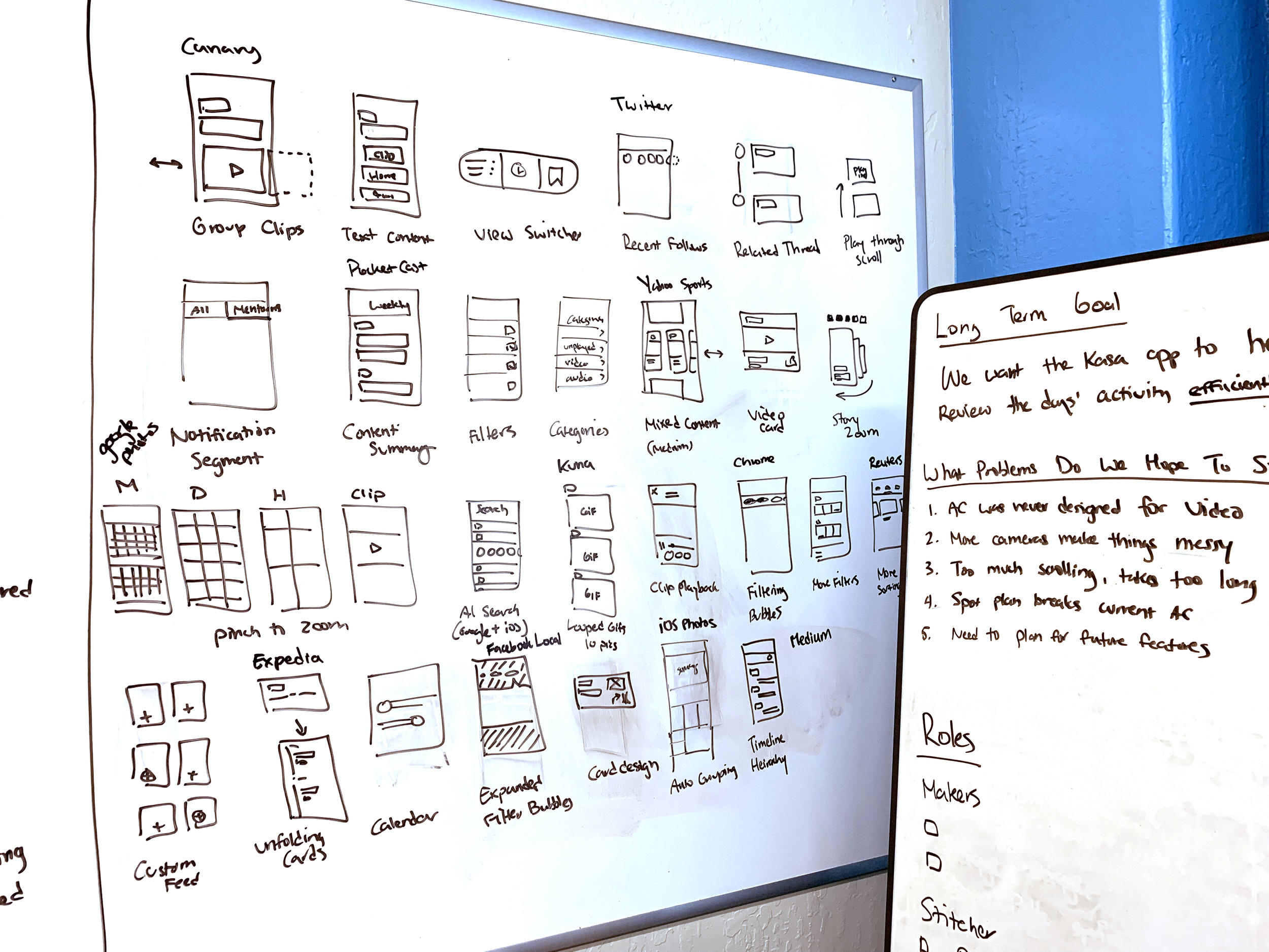
Armed with the How Might We notes as a guide, we gathered reference apps and websites which use inspirational methods to solve similar problems. The group demoed each example while I sketched the concept on a white board. Everything from news apps to sports websites were used as input.
Solution Sketches
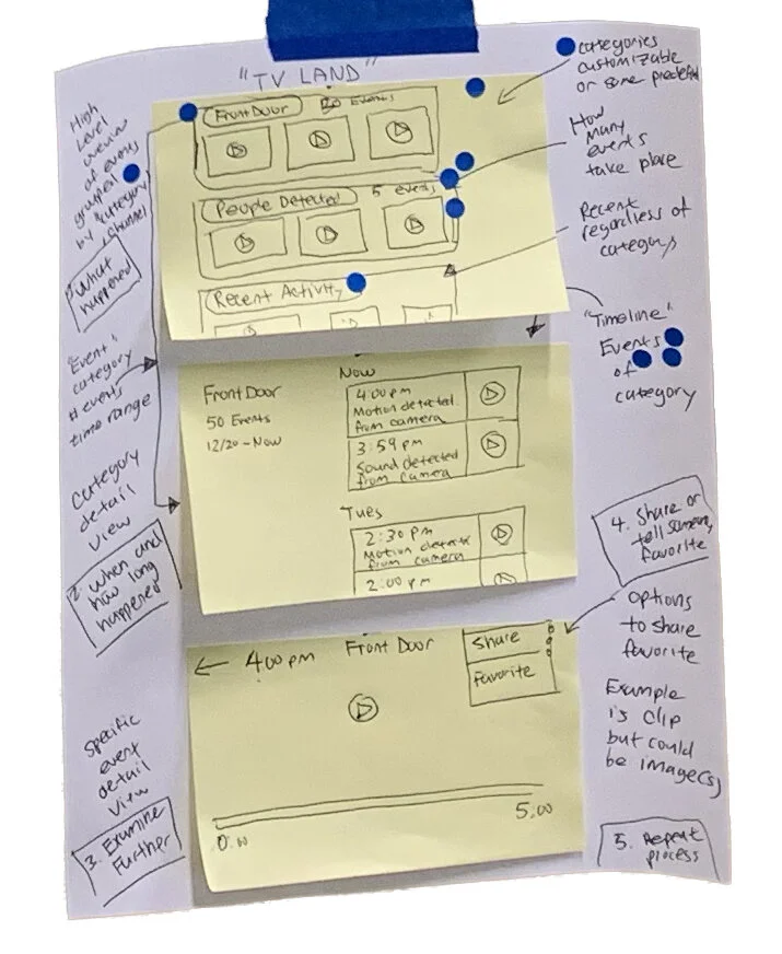
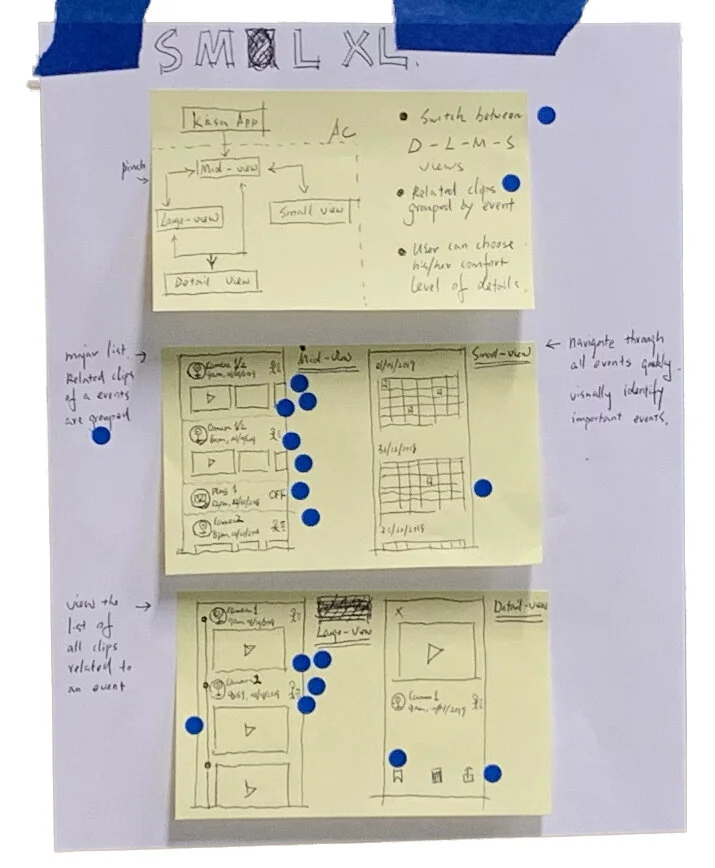
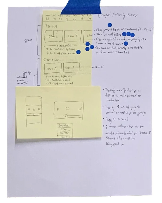
WIth the map and lightning demo concepts, each participant sketched out their own solution to the problem using the building blocks we had assembled so far. Everyone’s sketches were done on sticky notes contained on a single sheet of paper for explanation.
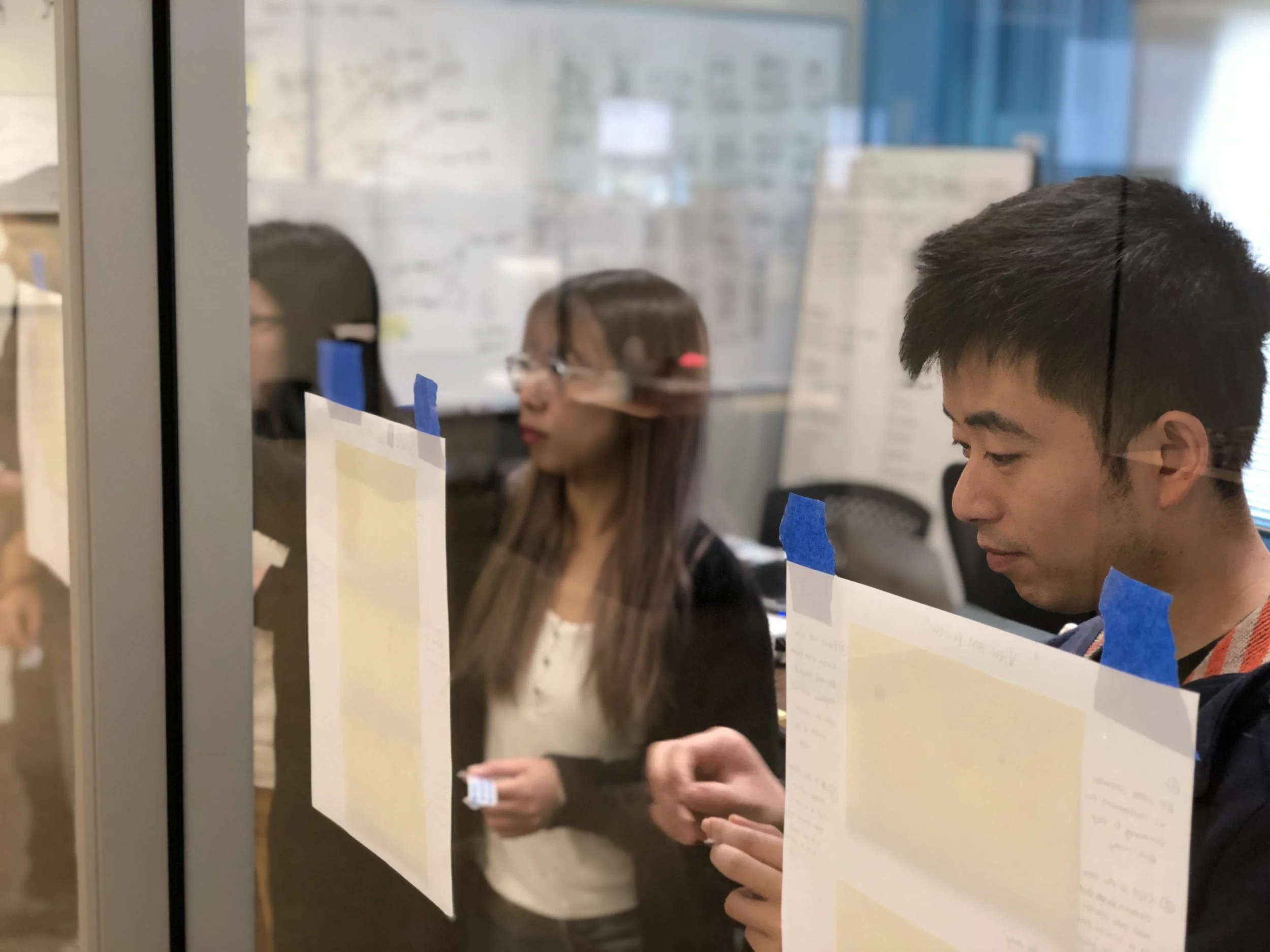
Once complete, the sketches were arrayed on the wall for everyone to see. I narrated the user journey as best I could from the content and everyone voted for their favorite ideas using blue dots. The ideas with the most dots were consolidated into a single user journey.
Storyboarding
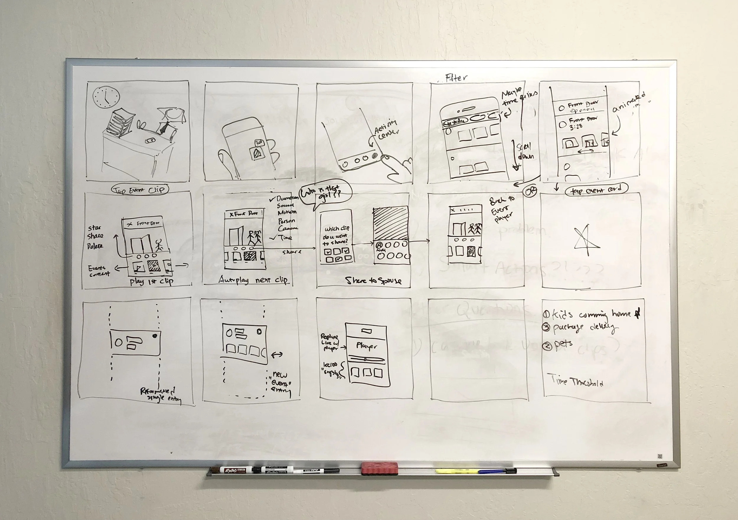
Halfway through our design sprint, we now had the requisite information to form a cogent prototype and sample narrative. We discussed and decided on a narrative around which we could create a storyboard to guide our prototype creation.
Our Scenario
I’m a parent at work when I get a notification on my phone; I see that my kids have come home from school and brought a friend with them.
Building the Prototype
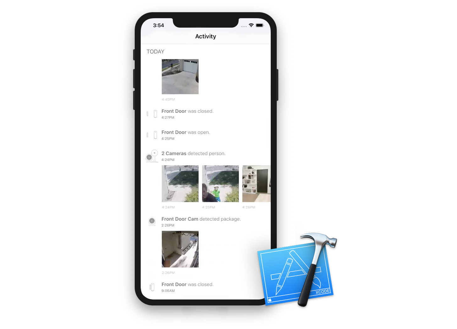
With our map created and the storyboard drawn, it was time to build a prototype that would allow us to test our ideas. With the team that we had assembled, we used sketch and Xcode to create a stub app to test the interaction.
New Layout
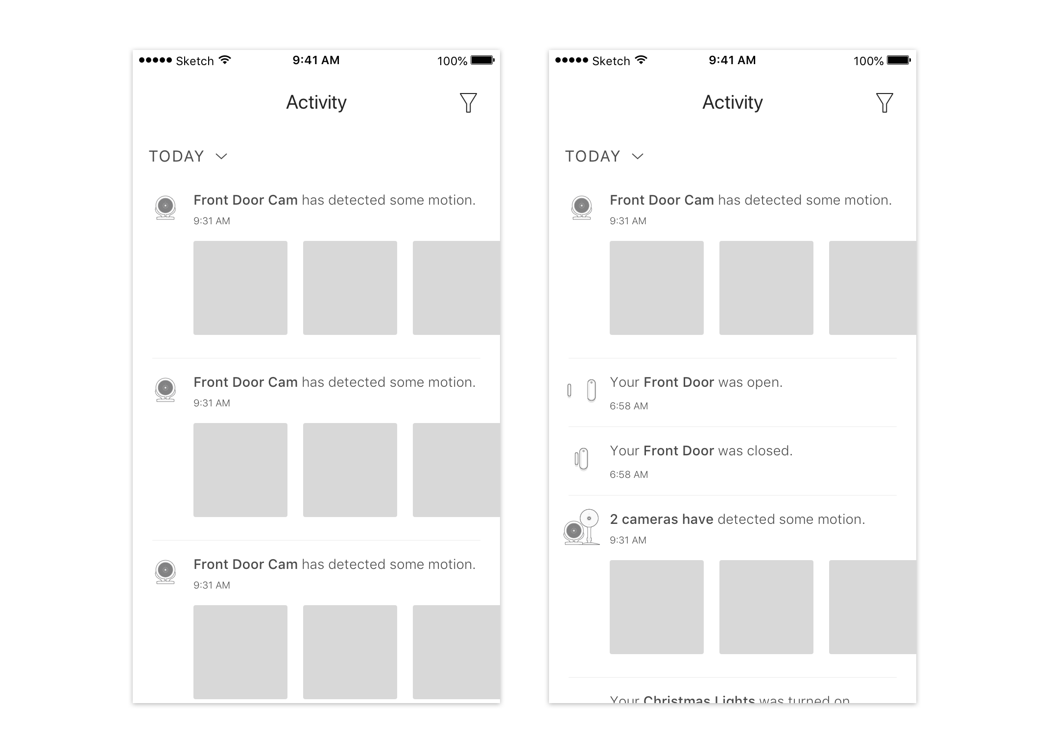
The redesigned interface leveraged horizontal scrolling, animated GIFs and event concatenation to display vastly more information than the old interface, while simultaneously becoming more legible.
Faking it with GIFs
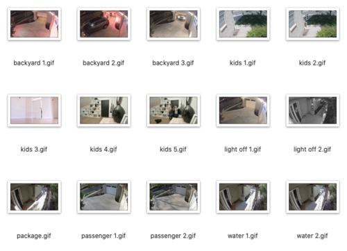
To quickly test the side scrolling idea as well as the motion preview, we converted actual camera video from my home into short animated GIFs.
Xcode to the Rescue
With the tools we had at the time, Xcode was the most straightforward to prototype our test. Fortunately, there are so many more advanced prototyping tools now that we wouldn’t need to bother with Xcode for something as trivial as side scrolling.
Testing Our Assumptions
It’s time to test our prototype and our design decisions against our real world scenario using human guinea pigs. We gathered five test subjects and conducted a guided interview.
Physical Setup
We set up two rooms for our testing. One room housed the test user, demo app and an interviewer. Everyone else was in a second room, watching the interview through a one-way video chat and taking notes.
Testing Room
Interviewer with interview script
Test user
Demo app on an iPhone
Conferencing mic and camera
Witness Room
Everyone else from the sprint team
Live feed from the interview room
Lots of note taking
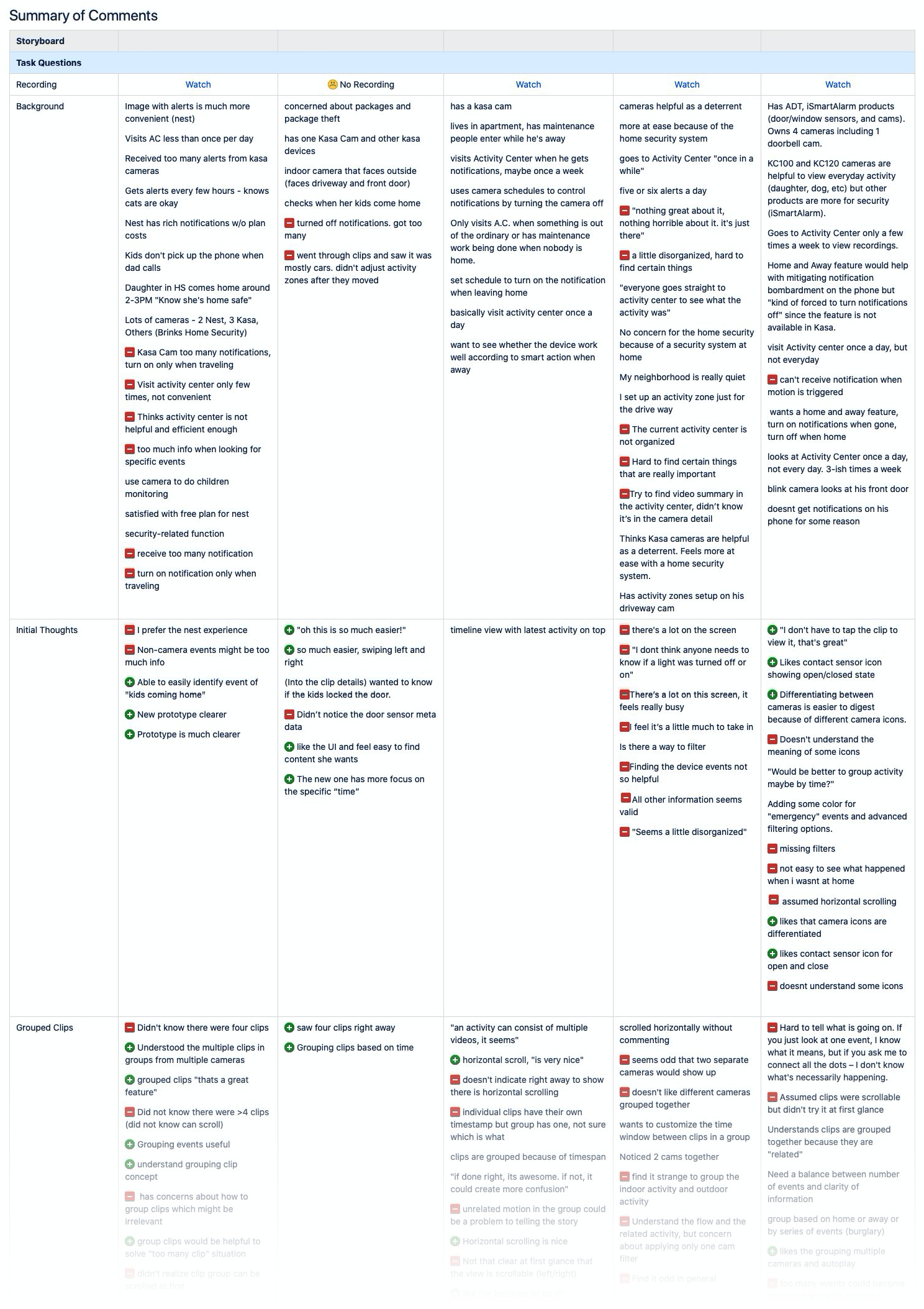
Lots of Notes
Watching users interact with a prototype is most illustrative, not just for the design team, but for every stakeholder. It’s a powerful way to shatter assumptions and personal convictions.
We took notes on a variety of factors to assess where the protuptye worked and didn’t.
What We Looked For
Tester background
Initial thoughts on the prototype
Grouped clips
Animated GIFs
Timeline storytelling
Clip details and subviews
Sorting Feedback
The notes were extracted and sorted into positive, negative and neutral observations. We used this to guide any changes to the prototype before we moved to finalize the design.
Positive Outcomes
Probably the best possible outcome was that the testers would prefer the new prototype to the existing experience.
Neutral, Need Follow-up
Some technical considerations were revealed about handling grouped data that we would need to review in an actual implementation.
Negative Results
One of our principle ideas of “story telling” with clips and sensor events was completely missed by testers.


