Designing for Scale
More Kasa devices, more screen sizes,
finite design team
Project Overview
Situation
Solve scalability issues with the Kasa app to support a rapidly growing array of products with a small design and development team
Task
Find a way to make common screens in the app as modular and reusable as possible while simplifying screen layouts to manage the growing variety of mobile screen sizes without requiring per-screen rework
Action
Distill and develop design templates for the common screen types used throughout the app and deploy a proper design system to codify consistent UI widgets for use on the newly templated screens
Result
Simplified the app design into three core screen types, two of which could be constantly re-used, while also implementing a design system to handle the broad array of UI widgets that were previously implemented as one-off components
Tools
Sketch
Invision
Principle
Time
2 Months for Concept Development
1 Year for Deployment
My Role
Design Lead
Design Smarter
If you’ve designed for iOS and Android, you probably know about constraint-based layouts or auto-layout. This implementation principle became our guiding light when we created the artwork scaling system. Rather than design artwork for each screen size, we designed a single, vector-based artwork and leveraged constraint pinning to ensure a consistent display, while minimizing rework needed for every supported screen size.
Three Types of Screens
To keep the system as scalable as possible, we wanted to fit as much as possible into concise categories so that they could be templated. A templated interface would allow the development team to optimize just a handful of designs and would also create a consistent interaction paradigm and look and feel for our customers.
Full-Bleed Artwork
Install and Setup Guides
Wire-in Guides
Device Control
Empty States
List Views
App Home
Settings
Feature-Specific Views
Camera-related Screens
Other One-off Features
Legacy App Features
Five Types of Control
Even with light switches, smart plugs, cameras, color changing bulbs and power strips, we were able to simplify the control interfaces to reuse as much as possible. The end result allowed us to perfect only five different screens for all of the different devices supported in the Kasa app.
On and Off
The most basic capabilities for a smart device involve controlling power. So all devices except cameras start here with a basic, obvious power toggle.
Color and animation are used to add additional visual feedback.
Dimming
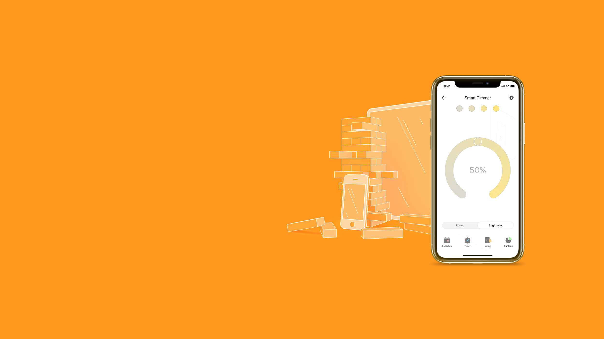
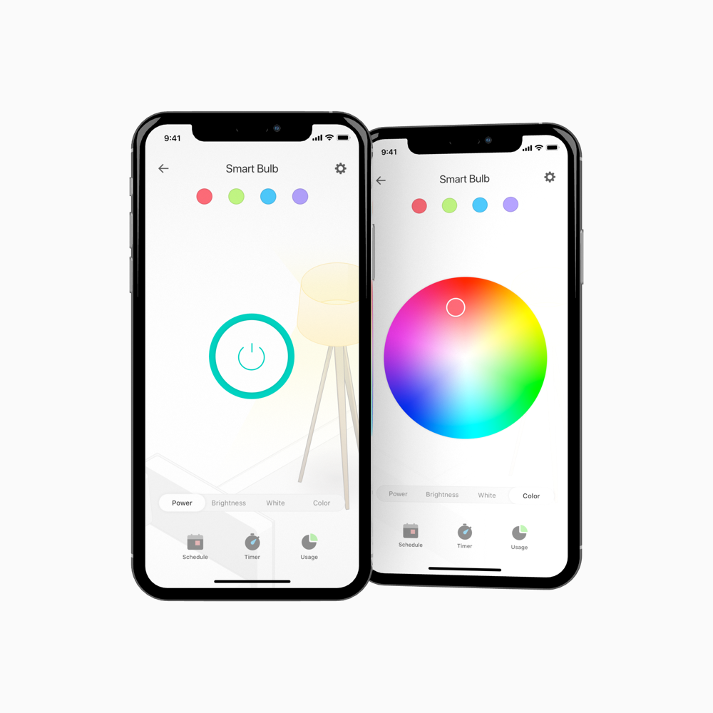
Dimmer switches and all smart bulbs can dim as well as toggle their power on and off. When a device supports this extra capability, a segmented control is added to the interface to allow users to switch between the two functions.
Color
The most advanced devices can change color, either just the color temperature of the white light emitted or a full color spectrum. Based on the device’s capabilities, the segmented control expands to include the correct color wheels.
Cameras
These devices are special and receive a custom interface that doesn’t match with the rest of the bulbs, plugs and switches.
The camera layout is, however, shared among all camera devices in the Kasa ecosystem. Buttons and icons are in the same style to draw common elements as much as possible.
Parent and Child
In addition to the control types described, some smart plugs, power strips and outlets have multiple controllable outlets. To accommodate this mapping, a paged interface appears that allows customers to simply swipe between the devices.
Full-Bleed Artwork
The majority of the “custom” content within the Kasa app can be found utilizing the full-bleed artwork layout.
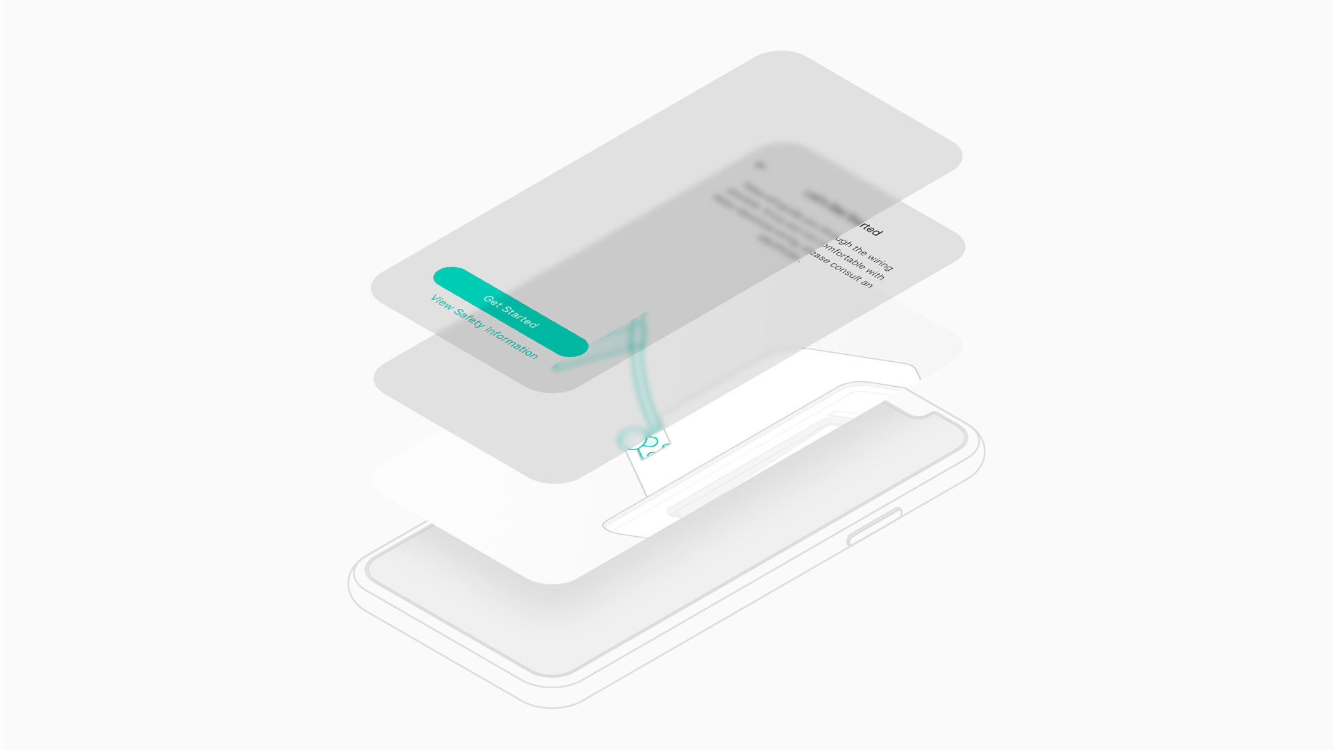
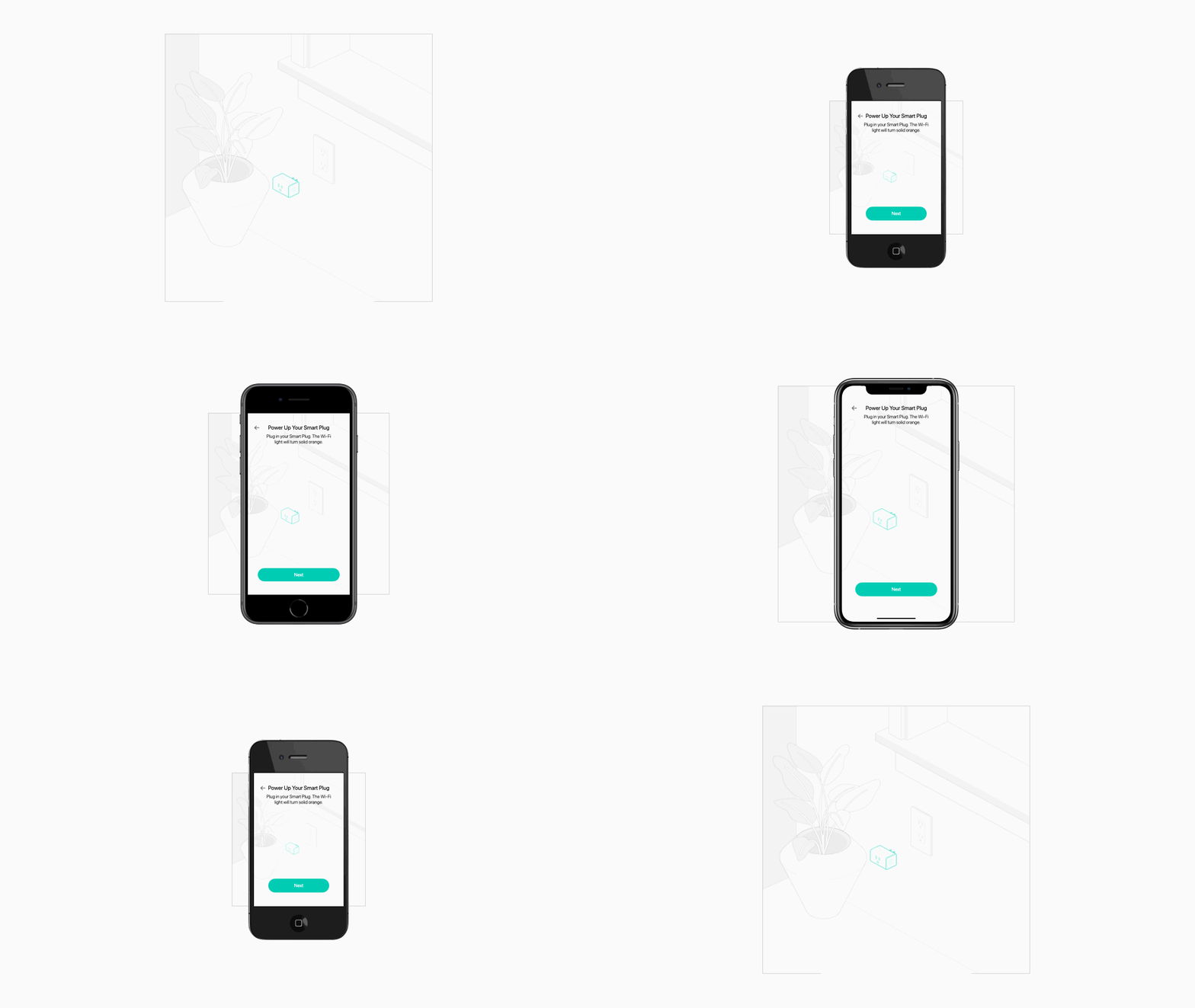
This very basic layout utilized three layers to create an immersive visual experience while also scaling to support a variety of screen sizes without requiring constant rework or customization.
Screens were divided into three layers. Two foreground layers for copy and interaction, and a third background layer with full-bleed vector artwork.
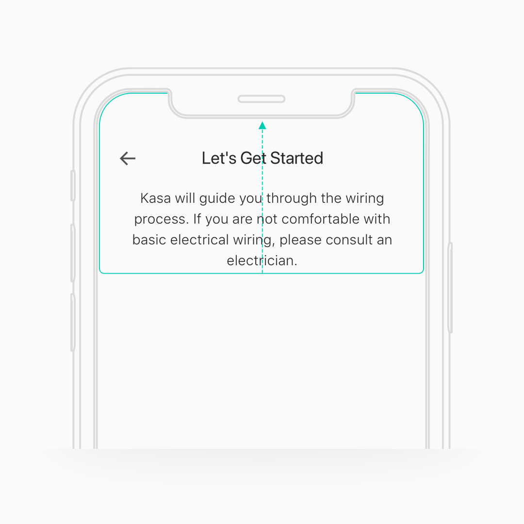
Pin to Top
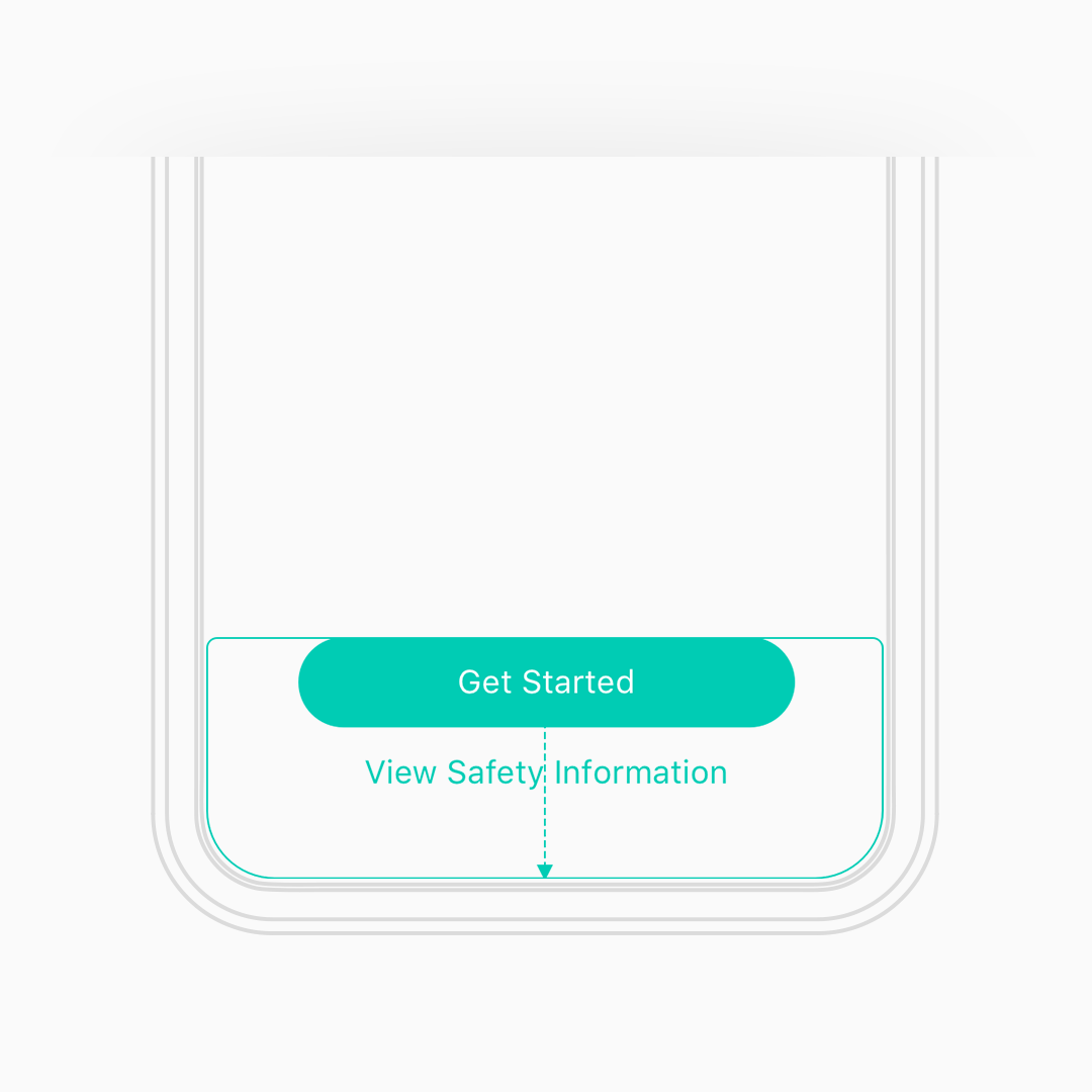
Elements like navigation and instructions are pinned to the top of the screen.
Pin to Bottom
Buttons and other action items are pinned to the bottom.
Keep it square.
The background artwork is square, pinned to the top and bottom edges of the device and the ratio is locked to prevent skewing.
The artwork is also drawn in a way so as to favor a centered subject. As long as the subject is mostly centered, it doesn't matter what kind of cropping is applied to the background by the user’s device.
Fully Scalable
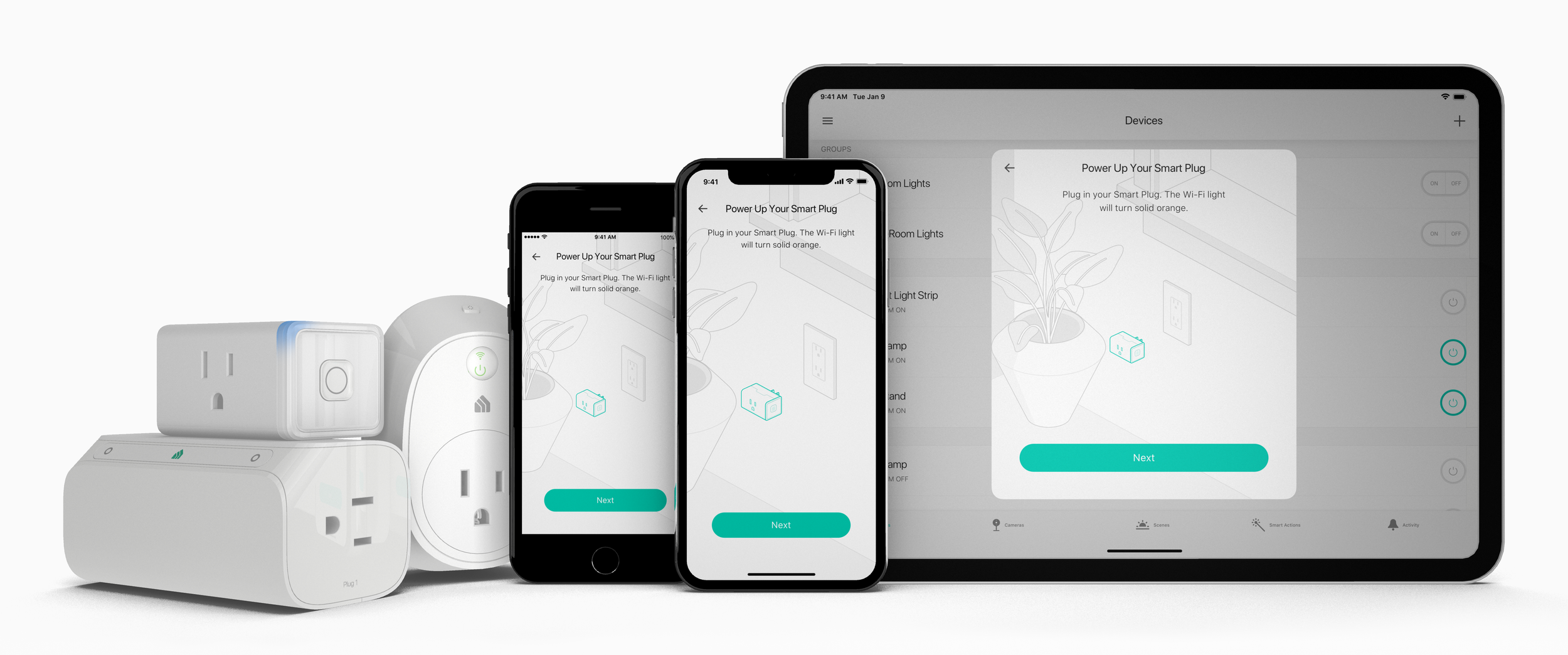
With this basic three layer system, main widgets on top and artwork in the back, we can support everything from iPhone 5 to iPad Pro with only very minor tweaks to our symbol library when a new screen size comes out.
In Practice
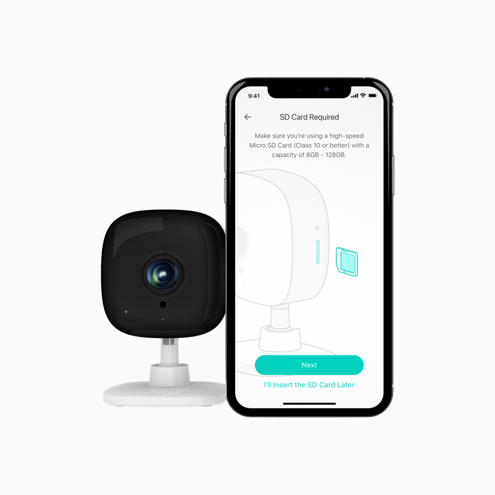
You can see how well this system works in the Kasa app if you step through an install or wire-in guide. This system has been deployed to all setup screens, guides and device control; pretty much anywhere the app uses full-bleed artwork.
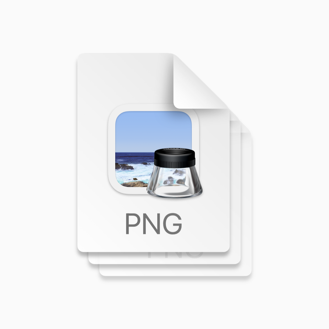
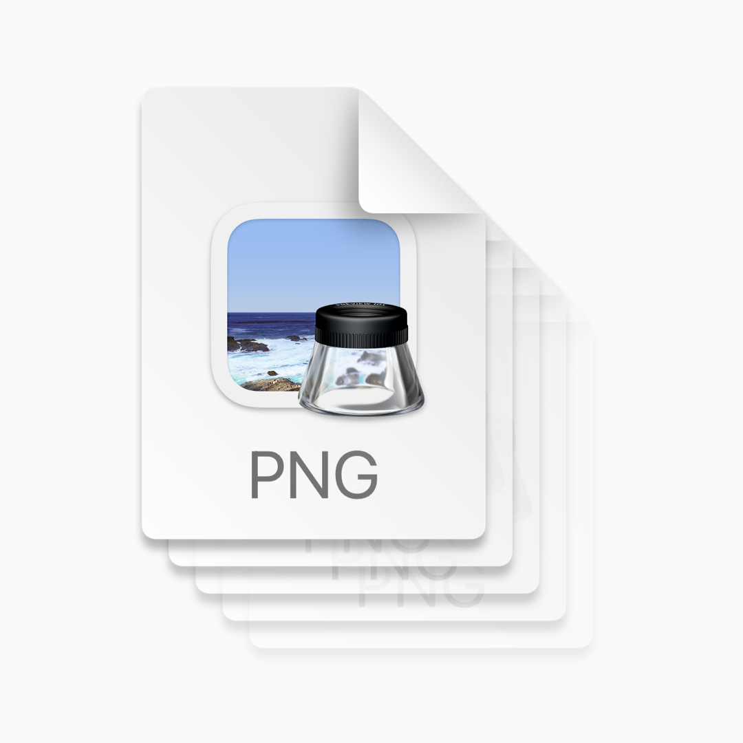
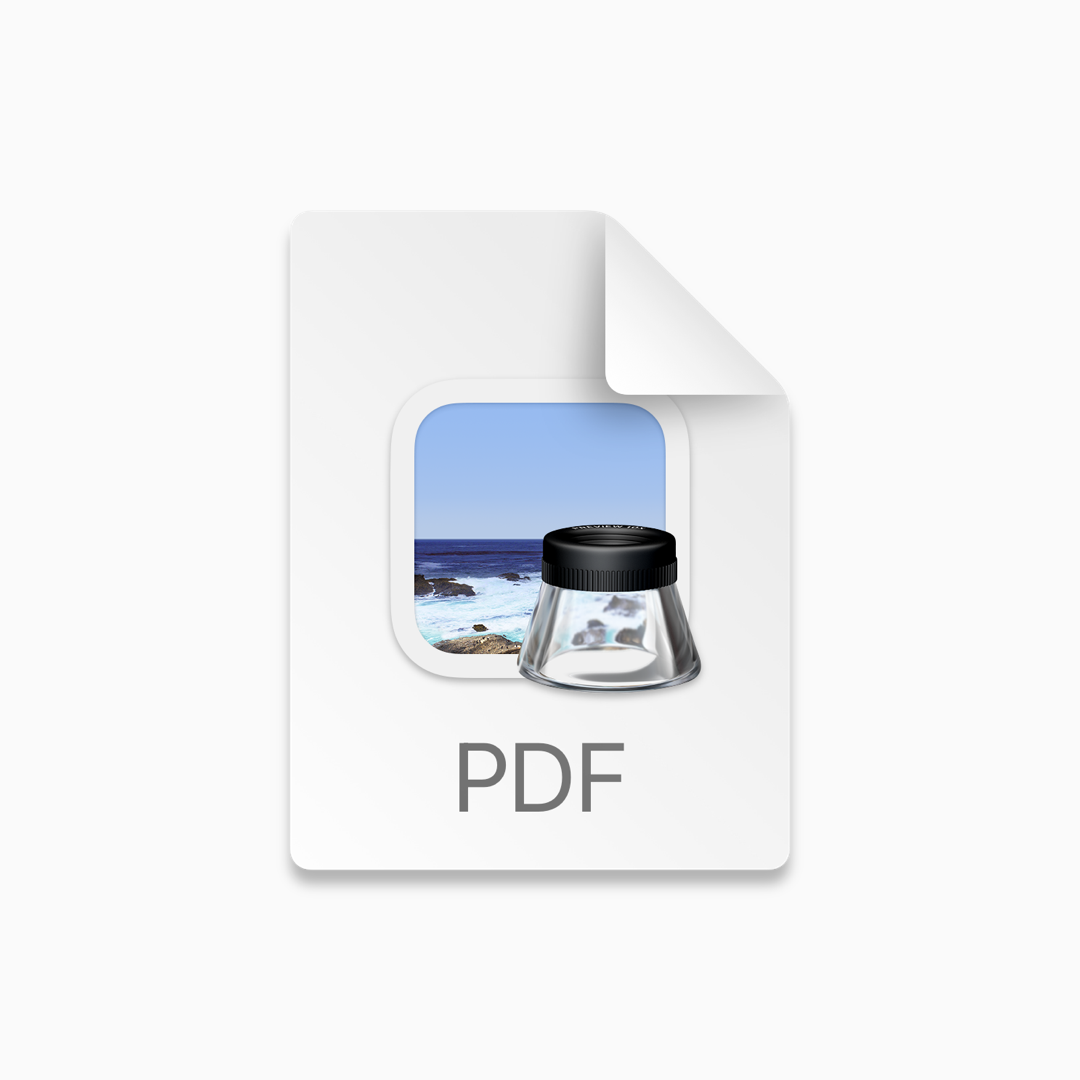
Scalable in method and in file size.
And since we distribute our artwork as either PDFs for iOS or SVGs for Android, screen size and resolution are non issues. This system isn’t perfect (we’ve found more than a few bugs in the PDF and SVG export engines in Sketch) but it has allowed our small team of designers to support almost 40 different devices and all of their associated artwork without ballooning the app bundle to impossible sizes.
5MB
3 Legacy Assets
iOS PNG Bundle
10.5MB
5 Legacy Assets
Android PNG Bundle
20KB
1 Vector Artwork
iOS PDF
50KB
1 Vector Artwork
Android SVG
Legacy
While all of the project stakeholders were firm believers in this effort for both its technical and artistic merits, everyone underestimated the amount of effort it would take to deploy all of these changes simultaneously.
We tested the deployment alongside a single new product introduction to limit scope, but even so, we encountered numerous issues with SVG rendering on the various flavors of Android and introducing animation (using Lottie) to the artwork types expanded the complexity even further. Our team quickly discovered that we were pushing the boundaries of what was officially supported for large, complex vector artwork on mobile platforms.
In the time since we began deploying this system, support for vector artwork has become significantly more robust on both iOS and Android.
